The Psychology of Color: How to Use Colors to Increase Conversion Rate
Selecting a color is more than just building a brand. It’s opening a path to the customer’s mind. If a company wants to gain more customers, it has to dive in with emotions. That’s why colors exist to portray a message. But, what if colors are misinterpreted? Is it important to know what they represent?
Understanding how to use colors will intensify a brand’s identity. One should consider the potential of clients and customers towards judgment. That’s when the psychology of colors comes into view.
What are the colors to live by?
There are so many graphic design elements that build up a brand. Once these are picked up perfectly, the brand gains value. What’s added to become more compelling is the color.
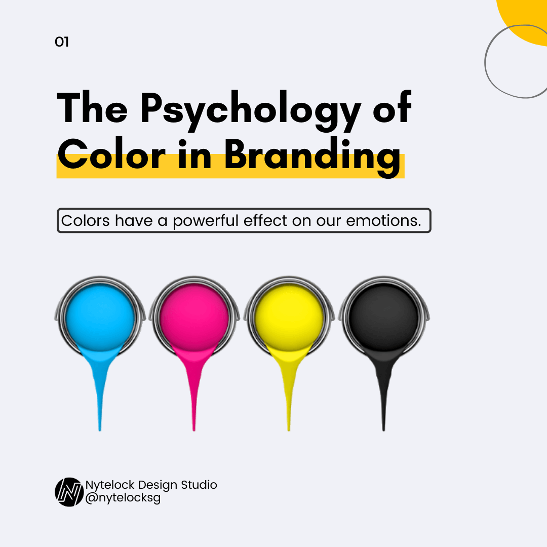
Here are the 6 colors to realize with emotion:
Yellow inspires and grabs attention.
Getting a brand design with a yellow touch encourages one to be positive, creative, and happy. Just like juicy fruits, yellow awakens resting energy to be warmed up. It’s directly referred to as sunlight that gives a bright morning every day. With this color, the brand illuminates the goal based on the customer’s expectations.
Green calms naturally.
When your eyes are tired, look for a green object. Or just open the door, go out to be refreshed. Green is friendly to the eyes since the retina doesn’t need to adjust Did you that green also possesses prosperity? Just like those trees standing tall, a wealthy business enterprise is welcomed through a healthy environment. Green should always blend in to grow a business. Even for a newborn business, green assures progress for this venture.
Blue earns trust.
Most brands appreciate the blue color. Aside from its serenity, this color attains to construct logical strategies to sustain a brand’s identity. Just like the sea and the sky, this reflection ties a string with the customers for an indefinite period. Customers become loyal because of feeling secure while being served by the company.
Black conquers all.
Some say it’s a symbol of darkness but most are impressed by its boldness. Depending on the brand that houses luxury, black paints elegance. From all the colors that are so catchy, black, on the other hand, neutralizes everything with authority. It emphasizes strength and sophistication. However, failure to use its features for the logo or brand’s design may result in a wide gap with potential customers.
Red is a passionate color.
Having the desire to dream of a successful business is the key to get a headstart. Red is a color that mixes energy and fearlessness as this color steals attention more. It’s more stimulating that drives the body to perform an action. That is to buy and come again. Moreover, red resonates energy while closing deals with ideal clients with excitement.
Purple is a highlight.
Building loyalty through a logo or brand is not yet enough. Companies must take note that purple is an important emblem when working to be recognized. What purple does on the brand is it offer wisdom and spirituality. Thus, it makes the name bigger with satisfactory performance. Also, the company becomes wealthy, efficient enough to expand its business from one location to another.
So what’s your color?
Colors are fascinating. They have to ability to connect transparently with customers. Their effects are memorable creating a stronger relationship. Even when the business goes up or down, colors will pave the way for dynamic success. Therefore, these must correspond correctly according to the business’s goal no matter what happens.