How We Built the Visual Identity of Local Taiwanese-Inspired Breakfast Shop
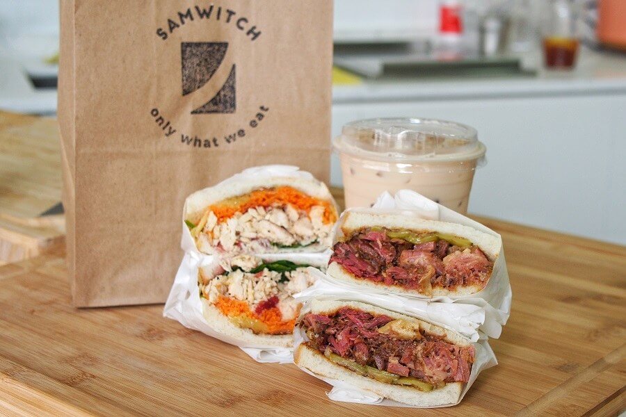
Samwitch is a local food stall in Singapore selling a variety of fresh sandwiches to their customers. Before they could launch, they needed a relevant and unique visual identity that would set them apart from the competition. Little did Nytelock know how difficult it would be to develop a working logo for the startup. At the start, a designer from the Team engaged with the client to learn about their problem. They needed a logo that could fit nicely with their already-planned idea for the interior of the stall: A modern wood-based design in light shades of brown. The logo could optionally convey their main product — a sandwich.
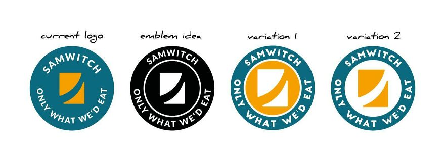
All preliminary ideas originated from the name of the company, Samwitch, a combination of “witch” and “sandwich.” Unfortunately, even though the designs were great, the client did not find the presented concepts suitable. Idea generation took more than a month, then two, and suddenly almost half a year. There was an issue with the development, and the problem had to be solved quickly. Recognizing that the project was halting, Nytelock immediately adopted a new strategy: Escalating the project and allowing more designers from the Team to help with idea generation. Something that turned out to be the necessary solution. A few days later, two rough ideas sparked the client’s interest, and the development of these became the Team’s primary objective.
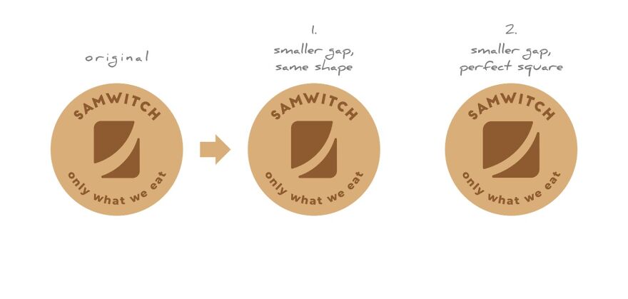
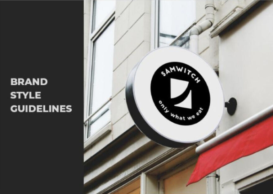
The client approved one of the ideas, inspired by the shape of a sliced sandwich, and accepted for finalization and further development. Nytelock worked every day of the week delivering countless variations of the concept, sometimes executing revision rounds by the hour. The logo was made, exported, and fully packed, and sent to the client. Suddenly and unexpectedly, the Team faced a tough challenge. The client wanted a change to the design. At this final stage, a change in the logo meant going backward in weeks or months of work, altering the logo, and forcing the Studio to export every single file with the alternated version once again. Without charging any extra fees, Nytelock sacrificed unpaid time and resources to deliver 100% customer satisfaction. Eager to drive the project to its end, the Team continued scrutinizing the logo regardless of weekends and Christmas holidays. Finally, after a month of intensive and exhausting work, the logo was finalized with a few changes, exported, and packed in a nicely organized folder system. As the cherry on top, the Team prepared a sixteen-page brand guideline document explaining how the logo should and should not be used, with ruling for minimum sizes, colors, typefaces, and real-life mockups. A detailed, print-ready, brand book ready to be handed out to the employees in full-color paper format. Armed with a robust visual identity and comprehensive guidelines, Samwitch was more than ready to open their food stall.
Having their backs covered by experienced professionals who gave them a big head start, the people at Samwitch could rest assured that implementing their new visual identity was nearly guaranteed to be successful.